User research
Interview
UIUX Design
Prototyping
Wordpress Development
Bacang Charity is an NGO that provide community services to the local public. They are quite frequent to raise donation and funding through offline activities currently. They are planning to provide an alternative and convenient method to their donors through online donation. So I have been assigned to assist them in design and develop a charity platform to raise donation.
Helps donors to make donation easy and convenient through online website.
I conducted an interview session with the client to further understand the users/customers’ persona & characteristics.
After the interview, the following are the ideal user profile and user stories that I used as the main reference to design and build the website:

“I wanted to make some donation to your organization, but the current process is too manual and tedious. I have no time to come over to the center.

“I prefer make donation through my mobile phone with various payment method, it is easier and faster.”

“I wish to donate money every month, but I couldn’t find a easy way to complete my donation”
The goal of this entire project is to achieve the following:
In order to achieve the goal, I have concluded with some features that must be included in the platform:
Firstly, I started by drafting the information architecture of the overall website structure.
Then, I create the user flow for the donors to make donation easy and faster.
Click Here to check out the live website.
Donation Goal progress bar is crucial to keep the donors well informed on the current donation status of the campaign. This is prompt to the donors decisions and enhance conversions.
Besides that, I have also designed a sticky button at the bottom of the screen to keep the donor's eye attention while scrolling on the campaign information. This definitely helps in terms of conversions.
During the interviews, I found out that the donors prefer more payment options. As far as I am concerned, there are some technical constraints in the development phase when using WordPress. So as an alternative, I decided to make the offline donation options obviously display on the home screen and every single initiative & campaign screen.
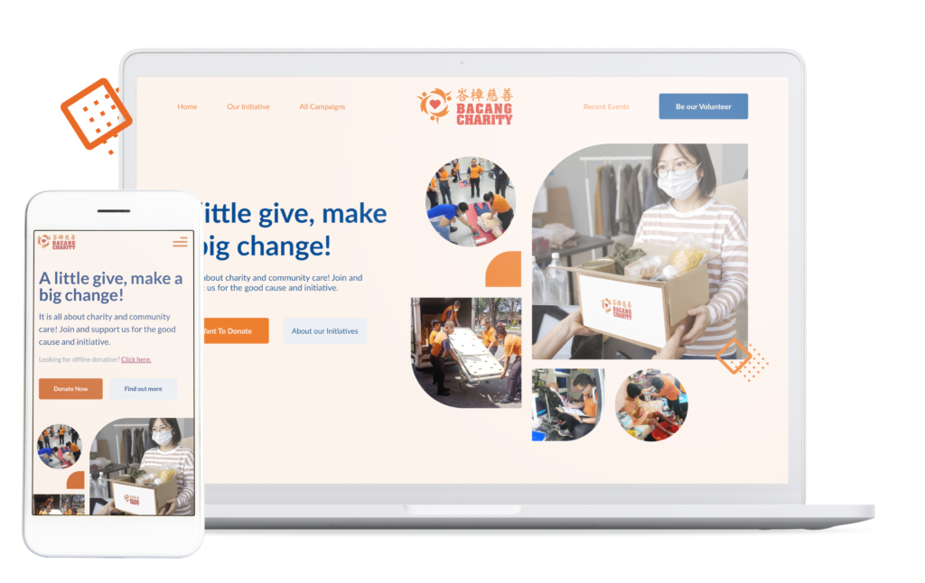
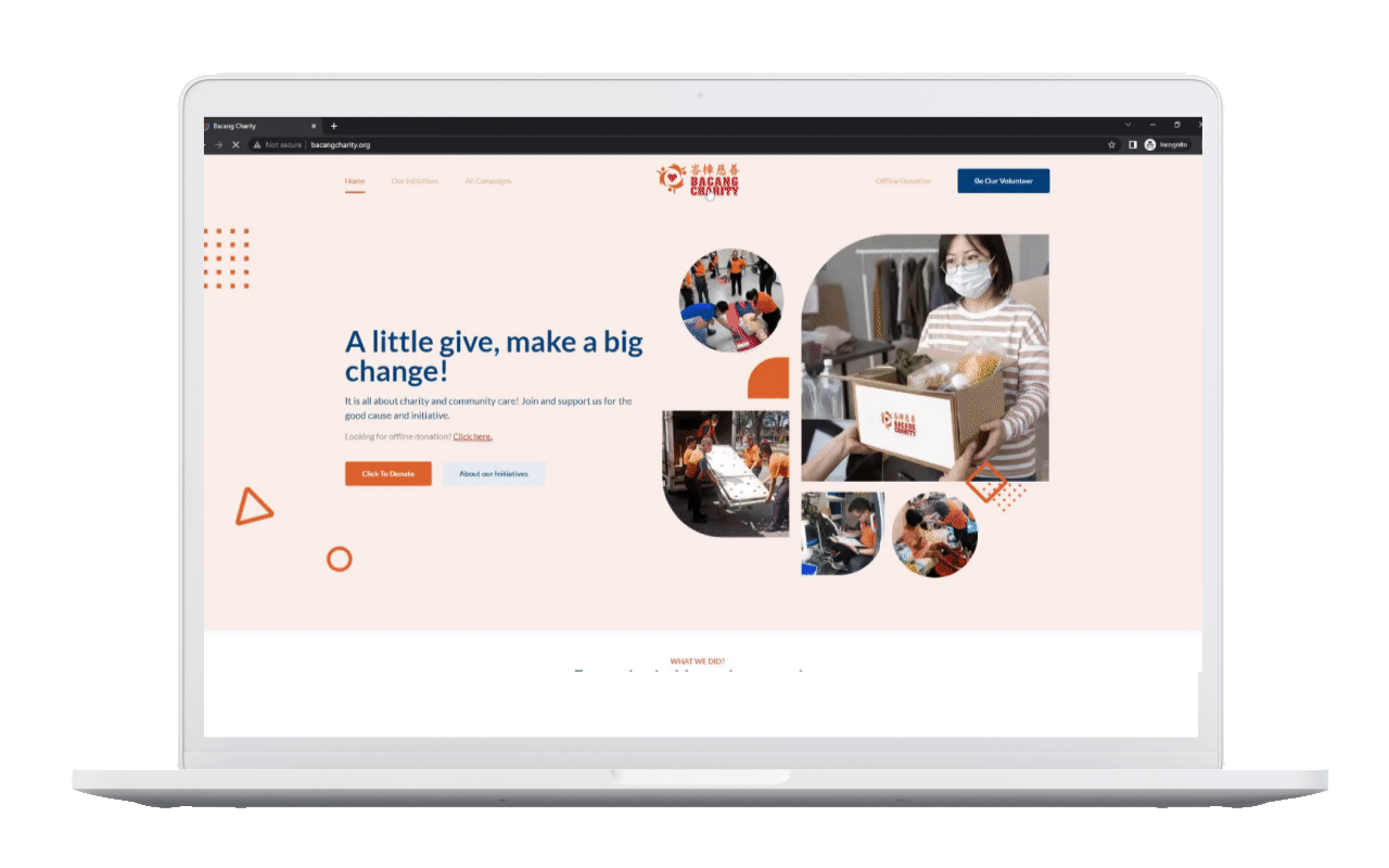
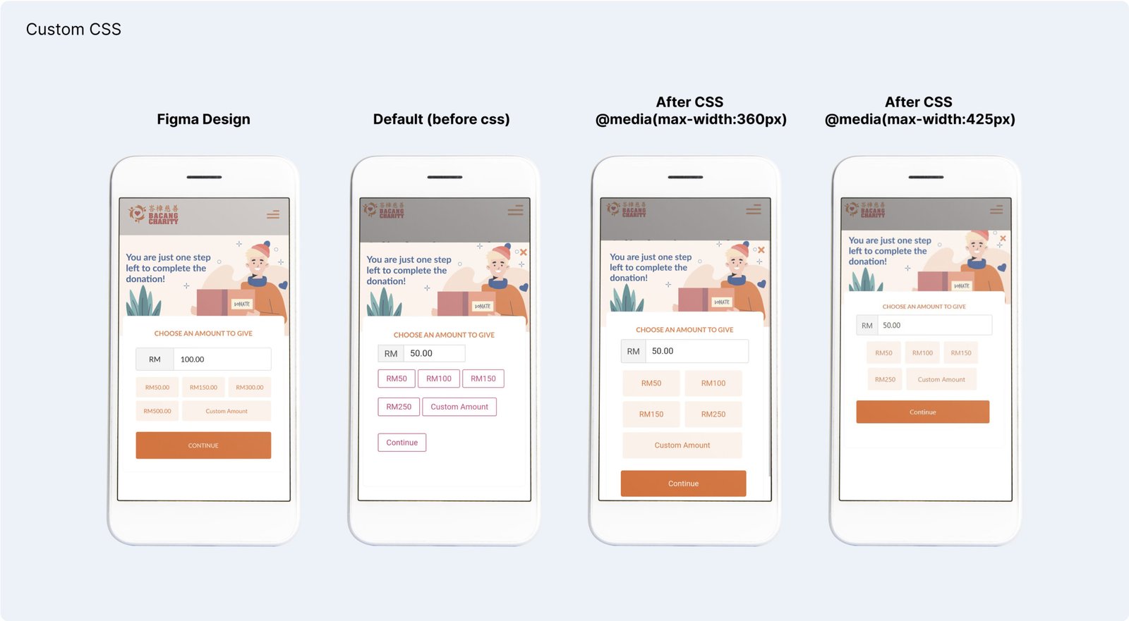
I have challenged myself to self-learn and apply custom CSS in this project. However, due to some technical constraints, I have tried my best to make the design as perfect as what I have designed in the Figma prototype. In terms of padding, margin, and alignment, it isn’t perfect yet in the live.
In overall, I feel satisfied with my personal learning growth in terms of design skills & techical skills.
If I was given more time on the project, I would like to further explore on the following expect: