thux

Web UIUX
Web & Mobile UIUX
User Dashboard
Draft
A web application for online bag authentic verification with ease & user-centric experience.

Type:

UIUX Design

Timline:

March'22 (3 weeks)

Tools:

Figma

My role:

User research

Interview

Wireframing

UIUX Design

Prototyping

Design System

Overview

Love Bite is a online bag authentic verfication platform for handbags owner. The product is still in the ideation stage where I was appointed to assist in delivering hi-fidelity protoype and developing a design system. The goal is to achieve minimal viable products(MVP).

Problem Statement

Helps handbags owner to get authentic check & verification quickly and easy through online.

UX Audit - Existing Website

User Interview

User Persona

I conducted an interview session with the client to further understand the users/customers’ persona & characteristics.

  1. 90% are female
  2. 30-40 y.o
  3. Housewife/ Manager/ Top Executive Level
  4. Wanted to resell to other buyers and buy new handbags.
  5. It is hard to find a physical legitcheck store nearby housing area.

After the interview, the following are the ideal user profile and user story that I used as the main reference to design the dashboard prototype:

Josephine
Manager

“I want to get a reliable legitcheck certificate quickly and easily. So I can resell my current branded bag & buy a new one.”

spacing
Mary
Housewife

“It is hard to find a physical legit check store nearby my housing area. How should I send my bag for a legitcheck quick and easy before I sell it?”

Sharifah
Housewife

“My buyer requested me to provide a valid legitcheck certificate for my branded handbags before she agree to buyover the bags. She has worry on the reliability of the bags.”

User Journey Mapping

I have perform a user journey map to better reflect on the action and decision make by the handbags owner throughout the entire process.

Workflow

The Goal

The goal of this entire project is to achieve the following:

  1. To achieve Minimal Viable Product (MVP).
  2. To ensure the UI consistency across the entire design to avoid user confusion.

My Solution

In order to achieve MVP, I have concluded with some features that must be included in the platform at this stage:

  1. To create verification request easy and quickly.
  2. To view & share the verification result easily from the dashboard.
  3. To pay through online payment.
  4. To track the progress status of the verfication request.
  5. To received in-app notification & email notifications.

Information Architecture

User Flow

Lo-fi Wireframing

Hi-fi UI Design & Prototyping

Key Highlight
1. Onboarding Page

We have tried out a few versions of the onboarding screen to test it out which would give the best experience to the user to try out the application without many barriers and resistance. We started from design V1.0 and revised it to V3.0 after going through some usability testing with the user as we encountered a few bad experiences in the design V1.0 & V2.0.

2. Create Authentic Request

To make the user feel as simple as 1,2,3 in using the application, I have created the Progress Bar for the user to have an overview of the entire process to create authentic requests this would result in a better conversion rate for the user to complete the task.

Besides that, I have included “Tooltips” for the icon to display the meaning of the icon when the user hovers on it to avoid user confusion.

3. Make Photo Uploading Easy

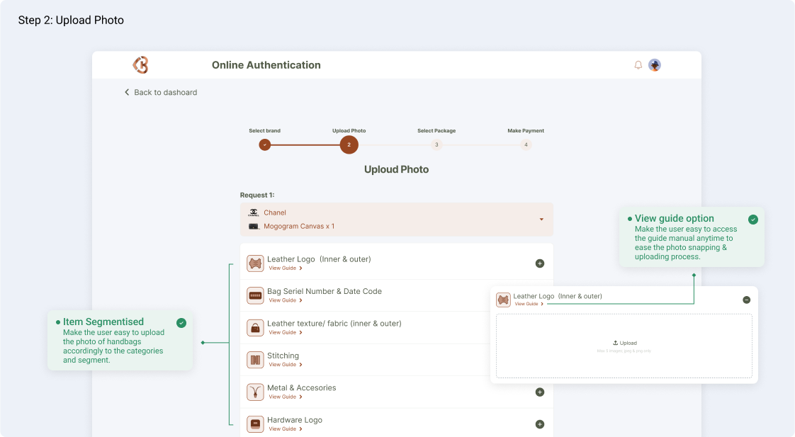
Upon applying the psychological principle of Zerganik effect, the principle found that people remember uncompleted/ interrupted tasks better than completed tasks. The psychological tension provided by an incomplete state helps us recall any relevant information we might need to complete the task.

In this section, I have decided to segmentize the criteria accordingly so that the user would be able to snap & upload the handbags accordingly in order to complete the authentication request task. The progress will be auto-saved in draft until the user completes the entire photo uploading task.

Besides that, I have also created a “View Guide” option in the respective segments so that the user would be able to access the guide manual at any time whenever the user feel not so sure “how and what” to proceed during the photo uploading process.

4. Success State

To enhance the user interaction, a success state is one of the crucial components that would definitely have a tremendous impact on the user experience. Success states inform users that they are closer to achieving a goal or already achieved the goal.

Why success state is so important? Because people are emotional creatures. When we interact with digital products, we feel emotions (both positive and negative). The peak-end rule suggests that people judge an experience largely based on how they felt at its peak and at its end, rather than based on the total sum or average of every moment of the experience. By creating a huge positive peak we have a better chance to make users remember our products.

5. Request Status Tracking

Upon creating the authentication request, it will take 24hours to release the authentication result. So it is very important to design a Request Status Tracking in the product. So that the user would be able to track and monitor their request at anytime until the result is released.

6. Result Display

Once the authentication result release, user can easily get the Unique Link URL in the respective request. So the user would be able to view and share the result page to their buyer.

My Thought

Conclusion & Lesson learned

In the nutshell, I feel excited and glad to be part of this project. This project is more complicated and is very useful to upskill my UXUI design thinking and problem-solving skills. If I was given more time and budget on this project, I would probably further explore the following agenda:

  1. To develop a mobile app design.
  2. To design more features and solutions like referrals, B2B vendor functions & etc.
  3. Add more Interactive & Motion Design.

Feel free to checkout my other works too!